How the World is against Productivity [Part 1]
UPDATE: Part 2 is up!
I’m stepping out of line here a bit and not just posting a ‘how-to’ or a roundup or something of the like. My first post’s more of a criticism… I tried to keep it to things I could prove, but a little bias may have slipped in here and there. My apologies for those.
Productivity is defined as how much anyone can make in a certain amount of time. Many factors go into this, such as how well you can concentrate, how fast you can type, and how many mouse clicks are required to navigate.
For the sake of organization, I’m splitting it up by hardware and software (Parts 1 and 2 respectively).
Part 1 – Hardware
Hardware consists of the parts of the computer we can physically touch, like the keyboard, the RAM (if so desired), hard drive, screen et cetera. You may not have thought of it before, but those really affect how well we can get something done. How easy would it be to type 20 pages on a keyboard that’s half the size of normal one? Not very. People that work with large excel files, web pages, or other long documents benefit from having larger screens with higher vertical resolution, so they don’t have to scroll as much. Resolution is perhaps one of the most important characteristics of a computer.
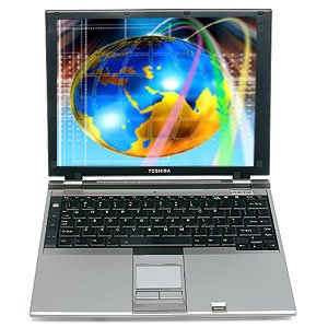 Most people may not have noticed, but over the last few years there has been a shift in formats for screens. Screens used to be in the 4:3 format. This means that for every 4 pixels that there were horizontally, 3 had to exist vertically. Resolutions such as 1024×768 were common on smaller screens. Programmers, for example, loved these screens because they could see many lines of code at once on large screens). Code generally tends to be many short lines rather than few long ones.
Then the shift to 16:10 panels happened, because it was cheaper to produce those (do the math on the area, when you keep the diagonal length the same). I actually like this format the best out of all of them. It is just wide enough to let you fit two documents side by side, and had a decent compromise on how much of something was visible vertically.
Sadly, the PC industry decided to follow the trend of the TV’s, and made a further switch to 16:9, the 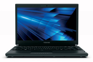 standard we have now. On smaller screens, 1366 × 768 is common, versus the 1280 x 800 before. It’s a nightmare that most comsumers happily won’t notice.
The problem isn’t necessarily that the resolutions are lower now. It’s that once you try to get the same number of vertical pixels onto that format, the pixel density is unusably high, or the screen much larger. For most people the icons and text would be a strain to see. To give an example, in the 16:10 format, 1440×900 pixels were fairly common on 13-14? laptops. Now however, with the 16:9 standard, the only way to get the same number of vertical pixels is to use 1600×900. This is not common on 13-14? laptops at all, because the area is smaller, and there are more pixels. Not to mention it’s probably more expensive to produce that pixel density.
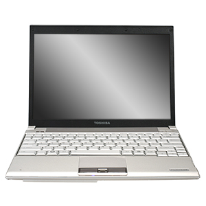
By the way: the pictures here are of the Toshiba portege r200, r500, and r835 respectively. Did anyone notice that the last iteration of the laptop has a larger screen (diagonal length) and less vertical room than the r500?
One other thing to note is that there has also been a general switch to glossy screens over matte ones. While this results in more vibrant colors and better video playback, it reduces viewing angles and doesn’t allow you to focus in an area with lots of light.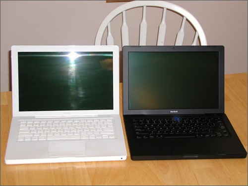
The only other hardware things we directly interact with a lot are the keyboard and mouse, which I can hardly say got worse (Good thing!)


Leave a Comment