YouTube Tests A Brand New User Interface
YouTube announced by blog post yesterday that they are testing out a new user interface called “Cosmic Panda”. Users of the popular video sharing service can try out this new interface by heading on over to http://www.youtube.com/cosmicpanda and hitting the “Try It Out” button. This redesign follows those of Gmail and Google Calendar.
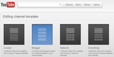
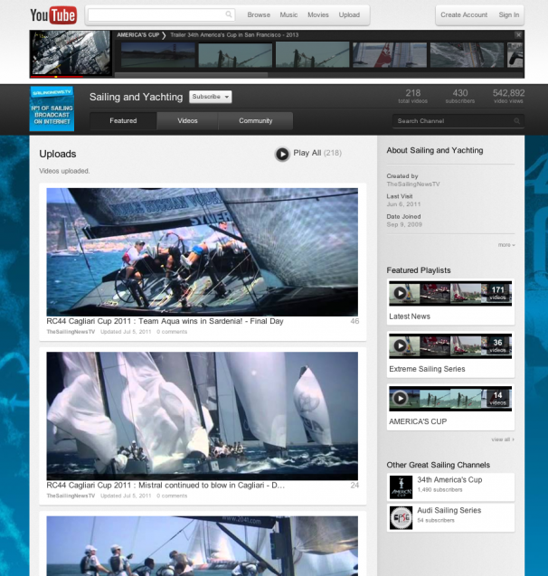
Overall, the new interface sports a darker color scheme as well as larger icons and buttons (ie. simpler). Channel interfaces are also greatly redone with the option to choose one of four templates. Each of these templates is focused at a different type of video publisher such as blogger, creator, and network. There is also an everything layout for people who publish a wide variety of videos.
Another new feature that I really enjoy is that videos continue playing in a neat little bar at the top of the page when you browse through other channels. For example, if you are watching the famous Double Rainbow music video and you click on your username in the top right corner, the Double Rainbow video will play in a litte bar at the top of the page while you browse your own channel.
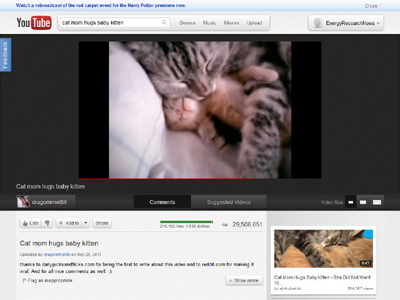
When viewing a video, you will notice that the player has the same features as the old player, but they are presented in a different way. Video size options are displayed by means of four buttons that are arranged in a horizontal bar under the video. If the video is part of a playlist, then the bar of videos in the playlist is displayed directly under the video. Like the mobile version of YouTube, comments or suggested videos can be displayed under the video player depending on which of two buttons is pressed under the video player. Like in the old version of YouTube, suggested videos are displayed along the right side of the comments.
I really like the new, elegant interface and hope that it will be officially implemented site-wide. What do you think about it? Do you like it? Comment!


Leave a Comment